Websites have changed a lot over the past few years. We’ve moved from simple layouts and static images to interactive experiences, bold typography, and designs that feel more personal.
But here’s the thing: not every new design trend is worth following.
A website might look impressive with animations, 3D graphics, and unusual navigation. Yet if visitors struggle to find your services or contact you, those visual effects aren’t helping your business.
The best web design trends in 2026 combine creativity with usability. They make websites interesting without getting in the way of what visitors came to do.
For businesses in Dubai and across the UAE, this balance is particularly important. A restaurant, real estate company, creative studio, and eCommerce store all have different audiences. What works beautifully for one may be completely unnecessary for another.
So, which design ideas are worth considering this year?
Let’s explore 17 trends, how they work, and when they actually make sense.
1. Scroll-Triggered Animations
Have you ever visited a website where images gently appear or text slides into place as you scroll?
That’s a scroll-triggered animation.
These effects can make a page feel more engaging and help introduce content in a deliberate sequence.
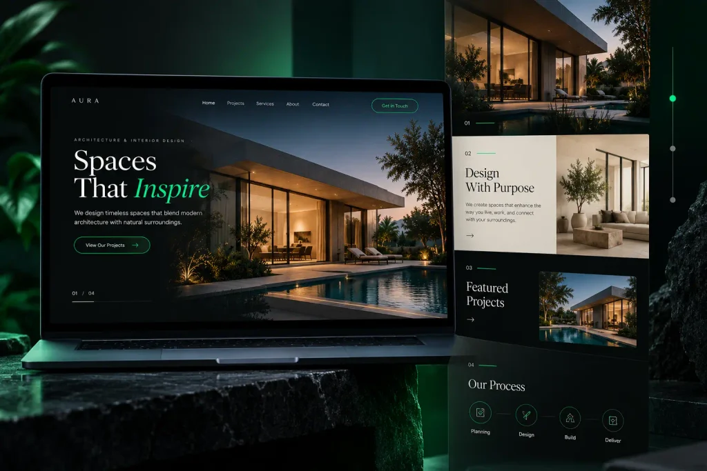
For example, an architecture studio could reveal project photographs as visitors move down the page. A creative agency might animate different stages of its design process.
The key is restraint.
If every heading, image, and button moves, visitors can quickly become distracted. Animations should help explain the content, not compete with it.
Best for: Portfolios, creative agencies, architecture studios, and storytelling websites.
Design tip: Keep animations short, avoid hiding essential information, and respect users who prefer reduced motion.
2. Micro-Interactions That Make Websites Feel Responsive
Sometimes, the smallest design details make the biggest difference.
Think about what happens when you hover over a button, submit a form, or add a product to your cart.
A subtle color change, loading indicator, or confirmation message tells you that something has happened.
These details are called micro-interactions.
They make a website feel more responsive and easier to understand.
For example, when someone submits an enquiry form, a clear success message is more helpful than leaving them wondering whether their message was sent.
Micro-interactions don’t need to be flashy. Their main purpose is to provide feedback.
Best for: Business websites, online stores, booking systems, and contact forms.
3. Subtle Micro-Animations
Micro-animations are closely related to micro-interactions, but they focus more broadly on small visual movements.
A logo might gently move when hovered over. An icon could shift slightly as a user selects a menu item. A card might lift a few pixels when someone points to it.
These details can make an otherwise static layout feel polished.
However, they work best when they’re consistent with the brand.
A playful animation may suit a children’s products website, while a law firm or financial consultancy may benefit from something more restrained.
Best for: Brands that want to add personality without making the website visually overwhelming.
4. Large Hero Sections With Clear Messaging
The hero section is usually the first major area visitors see when they open a homepage.
In 2026, large hero layouts remain a useful design approach, especially when they combine strong typography with clear messaging.
But bigger doesn’t automatically mean better.
A full-screen hero with an impressive image may look attractive, yet visitors still need to understand what the business offers.
For example, a Dubai-based interior design company could use a beautiful project photograph alongside a headline explaining its services and a button inviting visitors to view its portfolio.
That gives the visual design a purpose.
A good hero section should answer three questions quickly:
- What does this business do?
- Why should I be interested?
- What can I do next?
If you’re planning a new website, working with a freelance web designer in Dubai can help you balance strong visual design with practical business goals.
5. Parallax Scrolling
Parallax scrolling creates the impression that different elements on a page are moving at different speeds.
For example, a background photograph may move more slowly than the text in front of it.
When used carefully, this can add depth and make a website feel more immersive.
Travel companies, luxury brands, and creative portfolios can use parallax to tell a visual story.
Imagine a luxury resort website where visitors scroll through different scenes, moving from the exterior of the property to its rooms and facilities.
The effect can feel elegant when the transitions are smooth.
However, heavy parallax effects can create performance and accessibility problems, particularly on mobile devices.
Best for: Visual storytelling and selected landing-page sections.
Design tip: Use parallax sparingly and provide a comfortable experience for visitors who prefer reduced motion.
6. Negative Space and Cleaner Layouts
Not every modern website needs more visual elements.
Sometimes, removing unnecessary elements makes the design stronger.
Negative space, also called white space, refers to the empty areas around text, images, buttons, and other elements.
It helps visitors focus on what matters.
For example, a luxury jewelry brand may use generous spacing around product photography to create a refined appearance.
A consultancy website might use clean layouts to make complex service information easier to read.
Negative space doesn’t have to be white. Dark backgrounds can create the same effect when the layout has enough breathing room.
Best for: Professional services, premium brands, portfolios, and minimalist websites.
7. Interactive 3D Elements and Product Models
One of the more visually interesting website design approaches involves interactive 3D content.
Instead of looking at a single photograph, visitors may be able to rotate a product and explore it from different angles.
This can be particularly useful for online stores selling furniture, electronics, or products where shape and detail matter.
For example, a furniture retailer in Dubai could allow customers to rotate a chair or table before deciding whether it suits their space.
However, interactive 3D experiences can require additional development work and larger files.
They’re not necessary for every business.
For most service websites, professional photography and clear content may deliver a better experience with less complexity.
Best for: Product-focused eCommerce websites, real estate presentations, and interactive portfolios.
8. Creative and Custom Cursors
Most websites use a standard mouse pointer.
Some creative websites replace it with a custom cursor that changes shape, displays labels, or reacts when visitors hover over interactive elements.
For a design portfolio, this can create a distinctive visual experience.
Imagine hovering over a project image and seeing a small “View Project” label appear beside the cursor.
It’s a simple way to encourage exploration.
But custom cursors also come with limitations.
They don’t translate naturally to touchscreens, and unusual pointer behavior can make websites harder to use.
Best for: Creative studios, experimental websites, and interactive portfolios.
Design tip: Never make a custom cursor essential for navigating the website.
9. Isometric Illustrations
Isometric illustrations create the appearance of three-dimensional objects using a two-dimensional drawing style.
They’re often used to explain systems, buildings, processes, or digital products.
For example, a logistics company could use an isometric illustration to show how products move from a warehouse to delivery vehicles.
A software business might use a similar approach to explain how different parts of its platform connect.
These illustrations can make complicated ideas easier to understand without requiring full 3D models.
They’re also useful when real photography isn’t available or doesn’t communicate the concept clearly.
Best for: Technology companies, logistics businesses, real estate projects, and service explainers.
10. Claymorphism and Soft 3D Design
Claymorphism gives digital elements a soft, rounded appearance, almost as though they’re made from clay.
You’ll often notice rounded shapes, gentle shadows, pastel colors, and slightly raised surfaces.
This style can make interfaces feel friendly and approachable.
It may work well for educational websites, children’s brands, and playful digital products.
However, claymorphism isn’t suitable for every business.
A professional consultancy or corporate website may need a more restrained visual style.
Another important consideration is readability. Decorative shadows and soft colors shouldn’t make buttons or text difficult to distinguish.
Best for: Playful brands, educational products, and selected interface elements.
11. Art Deco-Inspired Website Design
Art Deco is known for geometric patterns, elegant typography, strong lines, and decorative details.
Although the style has a long history, it can still inspire distinctive modern website designs.
For example, a luxury hospitality brand might use geometric borders, refined typography, and carefully chosen metallic accents to create an elegant appearance.
The challenge is keeping the design modern and usable.
Too many decorative elements can make pages feel crowded.
Art Deco works best when its visual character supports the brand rather than dominating the entire website.
Best for: Boutique hotels, luxury brands, restaurants, and design-led businesses.
12. Purposeful Video Content
Video can help visitors understand a product, service, or business more quickly than a large block of text.
But that doesn’t mean every website needs an autoplay background video.
A short, relevant video can be useful when it answers a genuine customer question.
For example:
- A construction company could show a completed project.
- A fitness studio could introduce its training environment.
- A software company could demonstrate its product.
- A restaurant could showcase its atmosphere and food preparation.
These videos give visitors a better sense of what to expect.
However, large video files can slow down websites. Autoplay audio can also be disruptive.
Best for: Businesses with visual products, services, demonstrations, or customer experiences.
Design tip: Optimize video files, provide playback controls, and include captions where appropriate.
13. Typography-Led Hero Sections
A large background image isn’t always necessary to make a strong first impression.
Some websites use oversized typography as the main visual element.
A short headline, confident font choice, and carefully arranged spacing can create a striking design.
This approach works particularly well for brands with a clear message.
For example, a creative agency could use a bold statement about its work, followed by a short description and a portfolio button.
The result can feel modern without relying on heavy imagery.
However, typography-led designs require attention to readability.
A headline that looks impressive on a desktop may become difficult to read on a smaller phone screen.
Best for: Creative agencies, startups, personal brands, and modern service businesses.
14. Dark Mode and Dark Website Design
Dark backgrounds continue to be a popular visual choice for technology companies, creative portfolios, and premium brands.
A dark website can make photography, typography, and accent colors stand out.
For example, a black or charcoal background paired with carefully chosen green accents can create a modern, high-contrast appearance.
But dark mode isn’t automatically better than light mode.
It depends on your audience, content, and brand identity.
A website with long articles may need particular attention to text contrast and readability. An online store with product photography may benefit from a lighter background.
Some websites also provide a light and dark appearance option.
Best for: Technology brands, creative portfolios, premium products, and businesses with a suitable visual identity.
Design tip: Test contrast, readability, buttons, and forms in the actual design rather than choosing dark mode purely for appearance.
15. Data Visualization and Interactive Charts
Some businesses need to communicate information that would be difficult to explain through paragraphs alone.
That’s where data visualization helps.
Charts, diagrams, and interactive graphics can make complex information easier to explore.
For example, a property consultancy might use charts to explain market trends. A financial services company could visualize different cost scenarios.
An analytics platform might use an interactive dashboard to help customers understand performance.
However, the information must be accurate and clearly labeled.
A beautiful chart is not useful if visitors cannot understand what it represents.
Best for: Finance, real estate, technology, research, and data-heavy websites.
16. AI Chatbots and Smarter Website Assistance
AI-powered chat tools are another feature businesses are exploring.
A website chatbot can answer common questions, guide visitors toward relevant services, and help collect enquiries.
For example, an online store might use a chatbot to answer questions about delivery options or return policies.
A service company could use one to direct customers toward the right service page or contact form.
However, businesses should be realistic about what these tools can do.
An AI chatbot may provide incorrect answers, especially if it doesn’t have accurate business information.
Customers should also have a straightforward way to contact a real person.
For many small businesses in Dubai, a simple WhatsApp button or well-designed enquiry form may be more useful than an unnecessarily complex chatbot.
The best solution depends on the type of questions customers ask and how the business handles enquiries.
17. Voice-Activated Website Interfaces
Voice technology is familiar through smartphones and digital assistants.
Some websites and applications also explore voice-based controls that allow users to perform actions without typing or clicking.
For example, a specialized application might let users search for information using spoken commands.
This could be useful in particular accessibility or hands-free situations.
However, voice-controlled website navigation is not a standard requirement for most business websites.
It can involve challenges related to speech recognition, language support, privacy, and browser compatibility.
For a typical Dubai service business, clear navigation and an accessible search function should usually come first.
Best for: Specialized applications and interfaces where hands-free interaction solves a genuine user problem.
Which Web Design Trends Should Dubai Businesses Actually Use?
After looking at all 17 trends, you might be wondering which ones are worth adding to your own website.
The answer depends on your business.
A real estate agency may benefit from immersive visuals, project galleries, and interactive property presentations.
A small accounting firm will probably get more value from clean layouts, clear service information, and straightforward enquiry forms.
An online store might benefit from detailed product visuals, useful micro-interactions, and a smooth checkout experience.
A creative studio may have more freedom to experiment with animations, typography, and unusual layouts.
Before choosing a trend, ask yourself:
- Does it make the website easier to understand or use?
- Does it suit my brand and audience?
- Will it work properly on mobile devices?
- Could it slow down the website?
- Does it support an actual business goal?
If a design feature doesn’t improve the experience or communicate something useful, it may not be worth adding.
Modern Web Design Still Needs to Be Fast and Accessible
One thing that hasn’t changed in 2026 is the importance of website performance.
Animations, videos, and interactive effects can make a website memorable, but they also introduce technical considerations.
Large files and excessive scripts may slow down pages. Poor contrast can make content difficult to read. Motion-heavy effects can be uncomfortable for some visitors.
That’s why modern website design should balance appearance with usability.
If you’re improving an existing site, website maintenance services in Dubai can help address performance issues, broken functionality, and technical problems before introducing more complex design features.
And if you’re building a new site, the platform matters too. WordPress, Webflow, Framer, and other website builders offer different design capabilities and maintenance requirements.
The right choice is the one that suits your content, functionality, budget, and long-term plans.
Frequently Asked Questions
What are the biggest web design trends in 2026?
Notable web design approaches in 2026 include scroll-triggered animations, micro-interactions, bold typography, minimalist layouts, dark interfaces, interactive 3D elements, and AI-assisted website features. Their usefulness depends on the website’s purpose.
Is minimalist web design still popular?
Yes. Clean layouts, generous spacing, readable typography, and straightforward navigation remain useful because they help visitors focus on important content.
Are animations good for website design?
Animations can improve visual storytelling and provide useful feedback when implemented carefully. Excessive motion, however, can distract visitors, affect performance, and create accessibility issues.
Should every business website have dark mode?
No. Dark mode should suit the brand and audience. A light design may be more appropriate for websites with extensive reading content or certain product presentations.
Can modern web design improve SEO?
Modern web design can support SEO through mobile usability, logical page structure, accessibility, and performance improvements. Search rankings also depend on content relevance, competition, and other SEO factors.
Which web design trends are best for small businesses?
For many small businesses, clear layouts, mobile-friendly design, strong calls to action, fast loading, and simple navigation provide more practical value than complex visual effects.
Final Thoughts
Web design trends are useful sources of inspiration, but they shouldn’t dictate every decision you make about your website.
A trend that looks impressive in a design showcase might not work for a real business with real customers.
The strongest websites combine thoughtful design with clear communication and reliable functionality.
For some businesses, that means bold typography and subtle animation. For others, it means a straightforward layout that helps customers find information and get in touch.
Ultimately, the best web design isn’t necessarily the one with the most features.
It’s the one that works for the people using it.
Looking to Build a Modern Website in Dubai?
I’m Omer Farooq, a freelance web designer and developer in Dubai. I create responsive, custom websites for startups, small businesses, and growing brands.
Whether you’re starting from scratch or updating an existing website, I can help you choose design features that suit your brand and business goals.
Explore my web design and development services and get in touch to discuss your project.