Web Design
How Responsive Web Design Improve User Experience and SEO?
Omer Farooq · 1 May 2026 · 9 min read
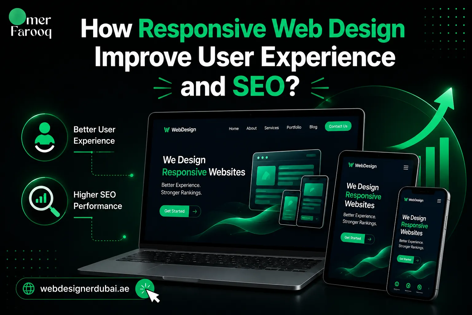
People use their phones, tablets, laptops, and other devices to browse the web every day. Your website needs to work well on all of them.
If a website looks good on a desktop but becomes difficult to use on a mobile phone, visitors may leave before they contact your business or learn more about your services.
This is why responsive web design services are important for modern businesses. A responsive website adjusts its layout, content, images, navigation, and other elements to fit different screen sizes.
For businesses looking for responsive web design in Dubai, the goal should be more than making a website look good. It should be easy to use, fast, mobile-friendly, search-friendly, and designed to support business growth.
A well-built responsive website can create a better experience for visitors across mobile, tablet, and desktop devices while giving your business a stronger foundation for SEO and conversions.
What Is Responsive Web Design?
Responsive web design is an approach to website design that allows a website to adapt to different screen sizes and devices.
Instead of creating one website for desktop users and another for mobile users, a responsive website uses flexible layouts that adjust automatically.
For example, a three-column layout on a desktop may change into a single-column layout on a smartphone. Images can resize, text can adjust, and navigation can become easier to use.
This makes the website more comfortable to browse without requiring visitors to zoom in or scroll from side to side.
Professional responsive website design services go beyond simply shrinking a desktop layout. The website should be planned around how people actually use different devices.
Mobile users have less screen space and often want to find information quickly. A good responsive website makes important content, buttons, navigation, and contact options easy to access.
Whether someone visits your website from a smartphone in Dubai Marina or a desktop computer in Business Bay, the experience should remain clear and easy to use.

Why Is Responsive Web Design Important?
Your website is often one of the first places potential customers interact with your business. If the website is difficult to use on mobile, you can lose visitors before they even understand what you offer.
Common problems on websites that are not properly optimized for mobile include small text, difficult navigation, poorly sized images, slow loading times, and buttons that are hard to tap.
These problems create friction for visitors. People expect websites to work smoothly without needing to zoom in, move the page sideways, or struggle to complete a form.
Responsive design helps solve these problems by adapting the website experience to the device being used.
For businesses investing in responsive website design Dubai solutions, this means creating a website that is easier for customers to browse, understand, and interact with.
How Does Responsive Web Design Improve User Experience?
A website should feel simple and natural to use regardless of the device. Responsive design helps create a consistent experience across smartphones, tablets, laptops, and desktop computers.
Here are some of the main ways responsive design can improve the user experience.
Better Navigation Across Devices
Navigation needs to work well on both large and small screens. A desktop menu may contain several links, while a mobile website can use a compact menu that is easier to tap.
Buttons, links, forms, and other interactive elements should also have enough space to use comfortably on a touchscreen.
A well-planned website design in Dubai should make it easy for visitors to find services, contact information, products, and other important pages.
Improved Readability
Responsive layouts help keep text readable on smaller screens.
Font sizes, line spacing, content width, headings, and paragraph spacing can all be adjusted for different devices. Visitors should not need to zoom in simply to read your website.
Better Mobile Experience
Mobile visitors often want information quickly. They may be searching for a service, checking a product, looking for a phone number, or trying to contact a business while they are away from a computer.
This is where mobile-first web design becomes useful. Important content and actions are planned with smaller screens in mind from the beginning.
More Consistent Experience
A responsive website keeps the overall structure and branding consistent across devices.
Visitors should recognize the same business whether they access the website from a smartphone, tablet, or desktop computer.
How Does Responsive Design Affect Website Speed?
Responsive design and website speed should work together. A website can look excellent on mobile but still provide a poor experience if pages take too long to load.
Large images, unnecessary scripts, excessive animations, and poorly optimized code can all affect performance.
When building responsive websites, I also consider image optimization, page structure, scripts, caching, and other factors that can affect loading performance.
A faster website makes it easier for visitors to access your content and interact with your business, especially when they are browsing from mobile devices.
How Does Responsive Web Design Help SEO?
Responsive design is not only about visual appearance. It also plays an important role in creating a strong technical foundation for SEO.
Google uses mobile-first indexing, which means Google primarily uses the mobile version of a website for indexing and ranking.
This makes it important for businesses to make sure their mobile website provides the same important content and functionality as the desktop version.
Responsive design can support SEO by providing:
- A consistent website structure
- Better mobile usability
- Easier access to website content
- A consistent URL structure
- Better overall user experience
- A stronger foundation for website performance
Responsive design does not automatically guarantee higher rankings. SEO also depends on content quality, technical SEO, website structure, search intent, backlinks, and many other factors.
However, a website that works poorly on mobile can create unnecessary problems for both visitors and search engines.
For businesses targeting responsive web design services, creating a mobile-friendly website should therefore be part of the overall SEO and website strategy.
Responsive Web Design vs Mobile-First Web Design
Responsive design and mobile-first design are closely connected, but they are not exactly the same.
Responsive web design means that a website adapts to different screen sizes and devices.
Mobile-first web design means planning and designing the website with smaller screens as a priority before expanding the experience for larger screens.
For many businesses, using both approaches makes sense. The mobile experience should be simple, fast, and easy to use, while the desktop version can take advantage of the additional screen space.
This can be especially useful for businesses looking for mobile-first web design in Dubai and wanting a website that performs well across different devices.
Why Is Responsive Web Design Important for Dubai Businesses?
Dubai is a highly competitive digital market. Customers often compare businesses online before deciding who to contact, purchase from, or work with.
This makes your website an important part of your first impression.
A slow or poorly designed mobile website can make a business appear less professional. On the other hand, a modern and responsive website can make it easier for visitors to understand your services and take the next step.
People in Dubai and across the UAE regularly use smartphones to search for businesses, products, services, restaurants, professionals, and local companies.
That means your website needs to perform well when someone discovers your business through a mobile search.
Professional responsive web design UAE solutions can help businesses create a consistent online experience across different devices and screen sizes.
The goal is simple: make it easy for potential customers to find information, explore your services, contact you, and take action.
What Are Common Responsive Web Design Mistakes?
One of the biggest mistakes businesses make is assuming that responsive design simply means making a desktop website smaller.
True responsiveness requires more attention to how people interact with a website on different devices.
Common mistakes include:
- Using oversized images
- Adding too many animations
- Making buttons difficult to tap
- Using complicated mobile navigation
- Ignoring mobile page speed
- Hiding important content on mobile
- Using layouts that do not adapt properly
- Failing to test different screen sizes
A visually attractive website is not enough if visitors struggle to use it.
Good responsive design should balance appearance, usability, performance, accessibility, and SEO.
What Do Responsive Web Design Services Include?
Professional responsive website services should look at the complete website experience rather than only the appearance of individual pages.
Depending on the project, my responsive web design process can include:
- Responsive desktop, tablet, and mobile layouts
- Mobile-friendly navigation
- Flexible page structures
- Mobile-friendly forms and buttons
- Image optimization
- Page speed improvements
- SEO-friendly website structure
- Conversion-focused calls to action
- Testing across different screen sizes
The exact approach depends on the type of website, target audience, content, and business goals.
Whether you need a business website, service website, landing page, or ecommerce store, the goal is to create a website that works smoothly for your customers.
Why Choose Me for Responsive Web Design Services in Dubai?
Choosing the right web designer can have a major impact on how your website performs online.
I provide responsive web design services in Dubai and across the UAE, with a focus on clean design, usability, performance, and SEO.
With more than 8 years of experience and over 300 completed websites, I understand the practical challenges involved in creating websites that work across different devices.
Instead of passing your project through multiple departments, I work directly with clients. This keeps communication simple and makes it easier to make decisions throughout the project.
I can build or improve responsive websites for businesses that need a professional online presence, a service website, landing page, or ecommerce store.
The focus is always on creating a website that is easy to use, performs well, and supports your business goals.
Final Thoughts
Responsive web design is now an important part of building a successful website.
Customers use smartphones, tablets, laptops, and desktop computers to search for businesses and make purchasing decisions. Your website needs to provide a smooth experience across all of these devices.
Professional responsive website design services can improve usability, mobile experience, performance, and the overall foundation of your website.
If you are looking for responsive website design in Dubai or want to improve the mobile experience of your existing website, I can help you create a website that works better for both users and your business.
Phone: WhatsApp
Email: Contact Me
Frequently Asked Questions
What is responsive web design?
Responsive web design allows a website to automatically adapt to different screen sizes, including smartphones, tablets, laptops, and desktop computers. It helps keep the website easy to use across different devices.
Why is responsive web design important for SEO?
Responsive design helps create a better mobile experience and provides a consistent website structure across devices. Since Google uses mobile-first indexing, having a mobile-friendly website is important for a strong SEO foundation.
Do I need a separate mobile website?
No. A properly responsive website can adapt to smartphones, tablets, and desktop computers, so you normally do not need to maintain a separate mobile website.
What is mobile-first web design?
Mobile-first web design means planning the website with smaller screens as a priority. The design can then be expanded and adapted for tablets and larger desktop screens.
Can responsive design improve website conversions?
Yes. A responsive website makes it easier for visitors to read content, navigate pages, use forms, and interact with calls to action. A smoother experience can help reduce friction and support better conversions.
How much does responsive web design cost in Dubai?
The cost depends on the number of pages, website features, design requirements, platform, and overall project scope. A simple business website will usually require a different budget than a large ecommerce or custom website.