A few years ago, businesses could get away with having websites that were designed mainly for desktop users. That is no longer the case today.
People now browse websites from smartphones, tablets, laptops, smart TVs, and countless screen sizes throughout the day. If a website fails to adapt properly to those devices, users notice it immediately.
Most visitors will not complain when a website feels difficult to use on mobile. They simply leave and move to a competitor instead.
This is one of the main reasons why responsive web design services have become essential for businesses that want to compete online seriously.
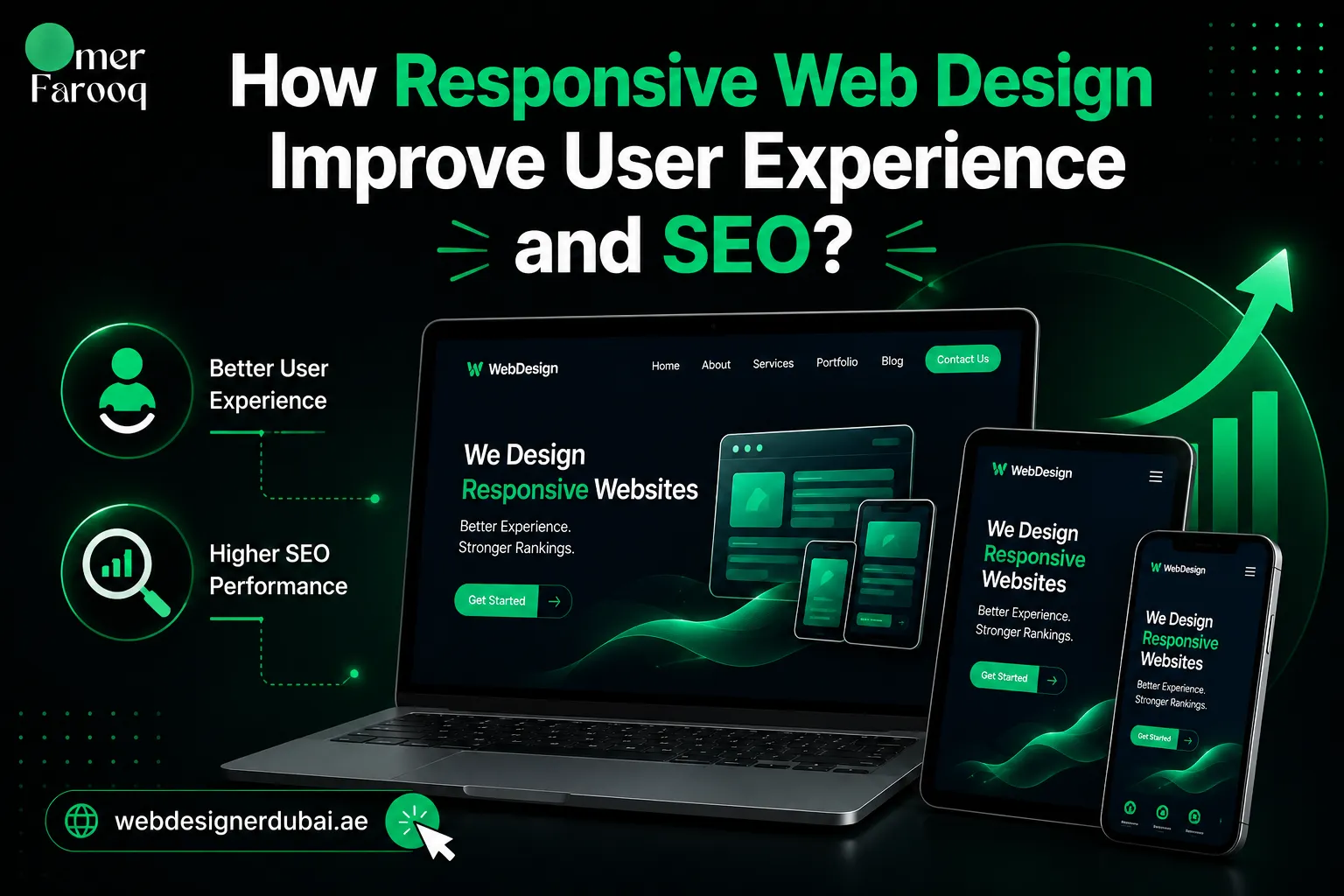
A responsive website adjusts automatically to different devices, screen sizes, and browsing behaviors. The goal is not only to make a website look better visually, but also to improve usability, engagement, search visibility, and ultimately conversions.
Businesses investing in proper mobile responsive web design often see improvements across multiple areas at the same time. Their websites become easier to use, load faster, perform better in search engines, and create a more professional impression for potential customers.
What Are Responsive Web Design Services?
At its core, responsive web design is an approach that allows a website to adapt dynamically across different devices.
Instead of creating separate desktop and mobile versions of a website, a responsive design adjusts layouts, images, text spacing, and navigation automatically based on screen size.
For example, a three-column desktop layout may transform into a cleaner single-column structure on mobile devices.
Menus become easier to tap, text becomes more readable, and images resize proportionally to fit smaller screens.
This creates a far smoother browsing experience for users.
Professional responsive website design services focus on much more than simple resizing. A properly responsive website considers how users interact with content on different devices. Mobile users scroll differently, navigate differently, and expect information much faster than desktop users.
This is why a well-designed responsive page feels natural regardless of whether someone visits the website from a smartphone in Dubai Marina or from a desktop office setup in Business Bay.
As someone who has worked with businesses across Dubai for years, I have seen many websites that technically “worked” on mobile devices but still created frustrating user experiences.
So if you haven’t looked at how your website performs across different screen sizes and devices recently, it might be time to do so
Why Mobile Responsiveness Is Important?
Mobile traffic now dominates online browsing behavior across most industries.
In many cases, more than half of a business’s website traffic comes directly from mobile users. This trend is even stronger in highly connected markets like the UAE, where consumers rely heavily on smartphones for browsing, shopping, and searching for local services.
When users visit a website that is not mobile-friendly, the problems become obvious within seconds.
Text may appear too small, navigation becomes difficult, pages load slowly, and buttons feel impossible to click accurately. These issues create immediate frustration.
Most users today expect websites to function smoothly without effort. They do not want to zoom in repeatedly just to read a paragraph or struggle through broken layouts while trying to contact a business.
This directly impacts user behavior. Visitors leave faster, engagement drops, and conversion rates decline. Search engines also recognize these negative user signals, which can eventually hurt rankings.
Businesses investing in responsive web design dubai solutions are not simply improving design aesthetics. They are improving how users experience their brand online.
How Does Responsive Web Design Improve User Experience?
Responsive design plays a major role in how users experience your website across different devices.
This is one reason businesses investing in responsive website design solutions often see improvements in both user engagement and conversions.
Below are some of the biggest ways responsive design improves user experience.
Better Navigation Across Devices
User experience is one of the biggest reasons businesses invest in responsive website design Dubai services. A website that feels smooth and easy to use naturally encourages visitors to stay longer and interact more.
One of the biggest improvements responsive design creates is better navigation. On a properly responsive website, menus, buttons, and layouts adapt naturally to different devices. Users can move through the website comfortably without confusion or unnecessary frustration.
Faster Loading Experience
Website speed plays a major role in user satisfaction. Mobile users expect websites to load quickly, especially when browsing on the go. Slow websites create friction immediately.
This is why I focus heavily on both responsiveness and speed optimization when building websites for businesses in Dubai. A responsive website that still loads slowly will continue to lose potential customers.
Improved Readability and Layout
Responsive layouts improve readability by adjusting spacing, font scaling, and content structure for different screen sizes.
Users should never need to zoom in just to read content. A properly structured layout keeps information clear and easy to consume regardless of device.
How Does Responsive Design Help SEO?
Many businesses still view responsive design primarily as a visual improvement. In reality, responsive design has become deeply connected with SEO performance.
Google now uses mobile-first indexing, which means the mobile version of your website plays a major role in determining rankings. If your mobile experience performs poorly, your search visibility can suffer as well.
This is one reason why responsive web design services are important not only for usability but also for long-term SEO growth.
Responsive websites generally perform better because they improve several ranking-related factors simultaneously. Faster loading times, improved usability, lower bounce rates, and stronger engagement all contribute positively to SEO performance.
Search engines pay close attention to how users interact with websites. If visitors leave quickly because a site is difficult to use on mobile devices, Google may interpret that as a poor user experience.
Therefore, businesses investing in responsive website design services often notice improvements not only in rankings but also in the quality of traffic and conversions they receive.

Why Is Responsive Design Especially Important for Businesses in Dubai?
Dubai is an extremely competitive digital market. Consumers constantly compare businesses online before making decisions, whether they are searching for restaurants, law firms, ecommerce stores, consultants, or local services.
This means first impressions matter significantly.
A business with a slow or poorly optimized mobile website immediately appears less credible compared to competitors with modern responsive websites. Users often make judgments about professionalism within seconds of landing on a page.
This is why demand for responsive web design in Dubai continues to grow rapidly.
Consumers in the UAE are highly mobile-driven. People regularly browse websites while commuting, shopping, attending meetings, or searching for nearby businesses. If a website fails to provide a smooth mobile experience during those moments, businesses risk losing valuable opportunities.
I have worked with businesses that saw strong improvements in inquiries and engagement after redesigning outdated websites into modern responsive platforms. In many cases, the issue was not the service itself.
The issue was simply that the website created too much friction for mobile users.
What Mistakes Do Businesses Commonly Make With Responsive Design?
One of the most common mistakes businesses make is assuming responsive design simply means shrinking a desktop website onto a mobile screen.
In reality, true responsiveness requires a much deeper understanding of how users behave across devices.
Some businesses overload mobile layouts with unnecessary visuals, animations, or oversized content sections that negatively affect speed and usability.
Others fail to test websites properly across multiple devices, leading to broken layouts or inconsistent experiences.
Another common issue is prioritizing appearance over usability. A visually impressive website may still frustrate users if navigation becomes difficult or loading times increase dramatically.
This is why responsive design should always balance aesthetics with functionality.
As a freelance web designer in Dubai, I approach responsive design from both a user experience and SEO perspective.
The goal is not simply to make a website “look responsive.” The goal is to create a website that genuinely performs better for users and search engines.
Why Hire Me for Responsive Web Design Services?
Choosing the right web designer can have a major impact on how your business performs online. Responsive design affects much more than appearance. It directly influences SEO, conversions, engagement, and brand credibility.
I provide responsive web design services for businesses across Dubai and the UAE with a strong focus on usability, performance, and long-term growth.
Instead of relying on generic templates, I build websites that are tailored to the specific needs of each business.
With more than 8 years of experience and over 300 completed websites, I understand the challenges businesses face when trying to create websites that perform effectively across all devices.
Unlike larger agencies where communication often passes through multiple people, I work directly with clients throughout the project. This creates a more streamlined process, clearer communication, and faster execution.
Whether you need a business website, landing page, or ecommerce platform, I focus on building responsive websites that support both user experience and SEO performance from the beginning.
Final Thoughts
Responsive design is no longer optional for businesses that want to compete online effectively. A website that performs poorly on mobile devices can negatively affect user experience, conversions, and SEO performance.
Investing in professional responsive web design services helps create a smoother browsing experience while improving visibility and engagement across all devices.
If you are looking to improve your website’s performance and user experience, feel free to get in touch to discuss your project and explore the right responsive web design solution for your business.
Phone: +971 52 884 5953
Email: omer@thedigitalelites.com
Frequently Asked Questions
Responsive web design means designing your website in such a way that it can adapt to any screen sizes on various devices, like phones, tablets, and laptops. It makes sure that your site is easy to use and looks great no matter how visitors access it.
Google favours websites that work well on mobile devices. A responsive design improves user experience, reduces bounce rates, and helps your site rank higher in search results.
When your website operates seamlessly on all devices, customers gain greater confidence in utilizing it. A positive experience increases their chances of remaining and returning.
No, with responsive design, a separate mobile site is unnecessary. It’s a single-site solution that performs effectively on every device.
Yes, when your website is easy to use and looks good on any device, customers are more likely to buy from you. It helps improve conversions.